

Getting started
Theme folder
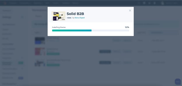
After your purchase, HubSpot will have migrated over the complete theme folder to your portal.
Child theme
You will be able to start using the theme right away, but we recommend you create a child theme first. Basically, a child theme gives you the best of both worlds: customizability and theme updates.
By creating a child theme, you'll be able to:
- Customize a theme's source codes without missing out on future theme updates
- Set up a separate child theme (and branding) for different domains. Each domain now can have its own logo, menu, colors, header, footer, and everything else.
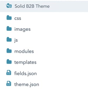
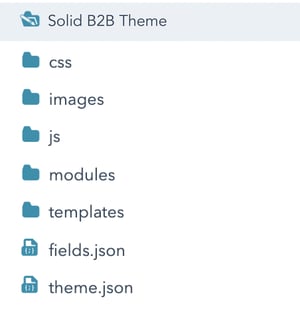 You can find your theme folder in the following path in Marketing > Design Tools > Files and Templates > Design Manager: /@marketplace/Stoica_Digital/Solid B2B Theme.
Here is a quick demonstration on how to create the child theme.
Customize your child theme
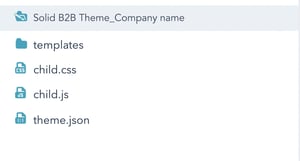
Go to the Design Manager section and click on the newly created child theme folder. At this point, it should look like this:
This is how the parent folder looks like when you download it:
In order to start customizing your child theme, follow these steps:
1. Create a clone of the parent theme folder - right click on the Solid B2B Theme folder and select Clone theme. Rename the folder to something distinct (it can be deleted afterwards) - e.g. Solid B2B Theme_TRANSFER_ONLY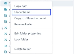
Let say you want to edit the Hero banner module and it has this path in the parent folder: /Solid B2B Theme/modules/Hero Banner.module
- Create a new folder named ‘modules’ in the child theme folder
- Go to the Solid B2B Theme_TRANSFER_ONLY folder, look up the Hero Banner module > right click > Move module > select the folder in the child theme (see example here)
Here’s an article from HubSpot on how to handle child themes:
https://developers.hubspot.com/docs/cms/building-blocks/themes/child-themes
Templates & modules
All included templates are 100% ready-to-use. You can create new pages with any of the pre-built modules to experience all the features.
Terms of Use
The copy of Solid B2B Theme you have in your portal is fully yours, but there are some terms and conditions that govern what you can and can't do.
Each license (purchase) is valid only in the portal it's purchased from. If you need to use the theme on multiple portals, you'll need to purchase or download the theme from each portal.
Things you can do
- You are licensed to use the theme on all domains within the portal it's purchased/downloaded from.
- Create a child theme (extending the original theme's folder) to customize its source files.
- Use the theme as your website foundation and develop new elements/features/modules extending the theme.
Things you can't do
- Migrate/Clone theme into a different HubSpot portal.
- HubSpot disables the option/feature to migrate purchased themes to another portal.
- You can't redistribute or resell our themes in any form.
Theme settings
How to edit your theme settings
Option 1.
In your HubSpot account, go to Settings > Website > Themes > select the Solid B2B Theme and start editing.
Option 2.
While editing one of your website pages, in the left sidebar editor, go to Design, then select Edit Theme Settings.
 Any changes you make to the theme settings will apply automatically to all existing modules & page templates. Use the reset button if you want to undo any of them.
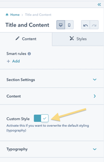
You also have the ‘Custom Style’ option for each module, if the Theme Settings don’t fully apply to your situation. The ‘Custom Style’ will override the Theme Settings for that specific module.
Important: If you have the ‘Custom Style’ option active on the module of a page you are previewing your theme settings on, you will not be able to see the changes.
Tip: We recommend testing your theme settings on a page created using the Modules Overview template. This way, you’ll have a better general idea of how all the modules will look like. If not all modules look great, don’t worry, you can use the ‘Custom style’ option you have available at page edit level.
Theme settings options
In the theme settings, you will find options to customise:
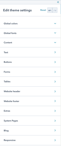
- Global colors
- Global fonts
- Content
- Text
- Buttons
- Forms
- Tables
- Website header
- Website Footer
- Extras
- System pages
- Blog
- Responsive
Important: The first time you access the Theme settings make sure to hit the Apply Changes button even if you didn't make any changes, so the theme will load all of its resources.
1. Global Colors
Here you can set your 3 main colors of your website. About 90% of the elements will inherit these colors.
2. Global Fonts
This is where you set the Primary and Secondary font families and their colors. These changes will apply to all text fields (except for the header, footer and buttons). The settings will be partially* inherited by the body text, h1-h6 and link style fields you have in the Text tab below.
3. Text
As mentioned above, the global fonts settings will be inherited by the body text, h1-h6 and link style fields you have in this section. Font families will apply to all, but the font color will apply partially, just because we wanted to avoid situations where you have body text on a similar colored background.
TIP 1: Use a color for the body text that will work on light backgrounds, then edit the modules that require customization using the ‘Custom style’ settings when editing each page.
TIP 2: Use a size for the body text that works well for most modules. For the hero banners, for example, you can use the ‘Custom style’ option if you need a larger font size.
4. Buttons
Here you can set the style of the buttons. You basically have 4 button styles:
- Primary
- Filled
- Outlined
- Secondary
- Filled
- Outlined
All button types have these settings: font style (type, size, color), hover settings, border radius, the option to remove the shadow* and the size & color of the icon. The icons will be added from the page editor, within each module with buttons.
The Outlined buttons, also have the extra settings for border: style, color & width.
Note 1: It’s better if you preview these settings on a page with a module that has all 4 types of buttons, so you can see how they fit together.
Note 2: The button shadow can also be deactivated from each module, at page edit level.
Note 3: The style of the form buttons can be changed from Theme Settings > Forms.
5. Forms
The form will inherit most of the global colors and fonts, but if you want any particular changes, here you can edit:
- Form styling (background color, border style, color, radius, spacing)
- Font style for Title, labels, help text, inputs, legal consent
- Inputs box border style and background color
- Submit button style
Note: In order to preview these changes you need to create first a page that contains one of your forms.
6. Tables
This is where you set the appearance of your tables. You can change: fonts, colors, border styles, fill colors, cell spacings.
7. Website header
Here you can customize the style of your header.
Info: In order to edit the items in your menu, go to Settings > Website > Navigation > select the menu you want to edit or create a new menu.
Below you can see the list of settings you have available:
Header settings
→ Header Width
- Boxed width - Your header width will match the body's content width
- Full width - Makes the header full width.
→ Header Layout
- Logo + Menu + Search - this header layout consists of the logo + chosen menu + search input
- Logo + Menu + CTA - this header layout consists of the logo + chosen menu + CTA (the last item is set as CTA - adds secondary button styling). If you don’t want the last item to look like a button, you have the option to turn the last item into a regular menu link.
→ Fixed header
- If this is active, the header will remain fixed at the top while scrolling along the page
- If this is active, there will also appear an additional setting for the header's background color when sticky
→ Header background color
→ Scrolled Header background color - this works if you are using the fixed header option
→ Hamburger Menu responsive breakpoint - here you can select the minimum viewport width the hamburger menu will appear.
Menu
- First level items
- Defines the styling for the menu items
- Here you can edit the font style and the horizontal spacing between items
- Dropdowns
- Defines the styling for the sub menus
- You can add a separator between dropdown menu items
- You can edit the items separator style, the background, the wrapper border, and the radius of the dropdown wrapper
Search input - these settings apply if you chose this header option: Logo + Menu + Search
→ Width
- sets the search input width
→ Background Color
- sets the search input bg color
→ Rounded Corners
- sets the search input border radius
→ Border
- Border on top - if checked, the border will be added on the search input while the header is on top (not scrolled)
- Border on scroll - if checked, the border will be added on the search input when user scrolls and the header becomes fixed
- Border - sets the border's styling
→ Shadow
- Input shadow on top - if checked, a box shadow will be added on the search input while the header is on top (not scrolled)
- Input shadow on scroll - if checked, a box shadow will be added on the search input when user scrolls and the header becomes fixed
8. Website footer
Here you can customize the style of your footer. You will find separate settings for:
- Typography
- Background color
- Padding (top & bottom)
- Social icons colors
9. Extras
→ Images - here you can customize the border of your images (if you want any, and the radius of the corners). You can also choose if you want to drop any shadows on your images
→ Shadow - this shadow applies to images (if selected) and some of the boxed elements (e.g. pricing cards)
10. System pages
System templates are used for certain types of pages generated automatically by HubSpot. In the theme settings you can customize the style of each of them, but if you need to make any content changes you have to edit the templates. Make sure to preview your changes on the System pages templates: https://share.vidyard.com/watch/sVELVNsJbi6RztKw1aiHmW
This is what each system page represents:
-
Error page: 404 and 500 error pages to let your users know that they have reached a page that does not exist or a technical issue has occurred.
-
Password prompt page: a password prompt page for any content you've locked with a password.
-
Subscription page: the subscription preferences page where your email recipients can manage the email types they are subscribed to and unsubscribe from all emails. Update this template to engage with your contacts during the subscription process (e.g., explain how your contacts can opt back into particular email types so they can resubscribe if they change their mind).
-
Backup unsubscribe page: a page that will appear for email recipients who are trying to unsubscribe, if HubSpot is unable to determine their email address.
-
Subscriptions update page: the confirmation page that appears when an email recipient updates their subscription preferences.
-
Search results page: the page that displays search results when visitors use the site search.
You can find more information on this topic in this HubSpot article:
11. Blog
TBD
12. Responsive
TBD
Modules
Modules overview
Each module can be used in multiple ways. You can find a description for the usability for each of them below.
At page edit level you have this generic structure:

- Section settings:
- Section background type (you can choose between color, image or video)
- Section padding (top and bottom)
- Section ID
- Content
- The settings here depend on each module’s structure
- Custom Style
- When turned ON, this is where you can overwrite the Theme settings
- For all of them you have Typography settings, and depending on the module we’ve added some extra settings to customize it and make it fit your needs perfectly.
Hero Banner
This module can be used in so many different ways. You can see a demo here on how many versions you can end up with only by changing the Content tab settings.

Below you can see the settings available for the Hero banner.
Note: depending on the Content type you select, settings may vary a bit.

Use Case Examples: https://solid.stoica.co/modules/hero-banner
Process horizontal
Use this module to showcase your process. You can add up to 5 steps, and highlight them by using numbers or an icon of your choice.
You can customize everything from background, to fonts, colors, button types, padding etc.
Below you can see the settings available for the Process Horizontal module:

Use Case Examples: https://solid.stoica.co/modules/process-horizontal
Process vertical
This one is similar to the previous module, but here you can display your process vertically. Also this includes room for an image (left or right, depending on how you prefer it). Based on the number of steps you add, the image size will adjust automatically.
You can customize everything from background to fonts, colors, button types, padding etc.
Use Case Examples: https://solid.stoica.co/modules/process-vertical
Timeline
Use this module to showcase the steps of a project or the history of your company. You can use an image for each step, and if you choose to remove it, you can adjust the text width. You can also remove the year box, simply by leaving the text field empty.
Use Case Examples: https://solid.stoica.co/modules/timeline-module
FAQ
Use this module to answer your client’s most frequently asked questions about your services, products etc. You can group them in categories, to make the answers easier to find.
The toggle bars width can be adjusted. You have 3 options to choose from: 1/1, 1/2 or 1/3. You can insert a link/button in each toggle and fully customize the style of this module (colors, borders, background, fonts etc.) using the Custom Style section.
Use Case Examples: https://solid.stoica.co/modules/faq-module
Results
A good way to highlight your company’s results, achievements etc. You can add up to 5 columns, with adjustable width depending on how many you choose to have.
Fully customize the style of this module (colors, background, fonts etc.) using the Custom Style section.
Use Case Examples: https://solid.stoica.co/modules/results-module
Offices Fullwidth Map
Use this module on your Contact or Event page. You can adjust the layout of the content columns and the height of the map. Plus the font characteristics in the Custom Style section.
Use Case Examples: https://solid.stoica.co/modules/offices-full-width-map-module
Offices Columns
Similar to Offices fullwidth map module, but here you can have up to 4 columns. For each location you can either embed a map or add an image (or none).
Use Case Examples: https://solid.stoica.co/modules/offices-columns
Table
Use this module to highlight the features you have for each type of service or product, or even to showcase your financial report over the years.
You can add an icon for each cell - we’ve set the default to be a checkmark, but you can choose others as well from the font awesome library. You also have the option to align it left and right.
Use the custom style section to adjust the size of the icons, change their color & play around with the typography settings.
Go to theme settings if you want to customize the border style, width, color & background color of the cells.
Use Case Examples: https://solid.stoica.co/modules/table-module
Partners
Use this module to showcase your partners list or awards & certifications. Adjust the number of logos you want to have per row and their alignment.
Head over to Custom style to adjust the background color of the logos, spacings, shadows and typography settings.
Use Case Examples: https://solid.stoica.co/modules/partners-module
Title and content
This is a classic title and content module. You can also add buttons, adjust the width of the content and align everything as you wish (left, center or right).
Use Case Examples: https://solid.stoica.co/modules/title-and-content-module
Counter
Counter with form
Similar to the Counter module. The difference here is that you can add a form instead of an image.
Use Case Examples: https://solid.stoica.co/modules/counter-with-form-module
Content section
In this module you can add 1 or 2 images next to a text section. You can choose how to align the content vertically & also where to position the images (left or right).
You can add or remove the borders, rounded corners or shadows of the images & also use the Custom style settings to adjust the fonts.
Use Case Examples: https://solid.stoica.co/modules/content-module
Content section full width image
Similar to the module above, but this time you can use the image full width.
Use Case Examples: https://solid.stoica.co/modules/content-section-full-width-image
Team members
Use this module to showcase your amazing team. You can add up to 4 members in a row, and even add icons with links to their profiles.
Customize the style of the images and typography using the Custom style settings tab.
Use Case Examples: https://solid.stoica.co/modules/team-members-module
Gallery
Use this module to showcase a collection of images (eg. a Portfolio section). You can add up to 4 images in a row. You also have the option to open the images in a lightbox (once you click an image, a pop up will open containing the image in a bigger size).
Note: If the Lightbox option is active, you won't be able to add custom links to the images.
Customize the style of the images and typography using the Custom style settings tab.
Use Case Examples: https://solid.stoica.co/modules/gallery-module
Pricing cards
A highly customizable module, that you can use to present your pricing offer & benefits for each tier. You can add up to 4 cards per row, and have the option to also use an image for each.
Plenty of settings to edit in the Custom style section, such as typography and card styles (normal and featured).
Use Case Examples: https://solid.stoica.co/modules/pricing-cards-module
CTA section
Similar to the Title and content module.
Use Case Examples: https://solid.stoica.co/modules/cta-module
Testimonials slider
The classic way to showcase your clients’ testimonials. You can add up to 3 testimonials per row. There is an autoplay option where you can also set the transition speed.
In the Custom style section you can change the background color of the cards, the quotation mark and arrows color, and you also can find there the usual typography settings.
Use Case Examples: https://solid.stoica.co/modules/testimonials-slider-module
Content Section with Video
Similar to the Content section module. Here you can embed or upload a video.
Use Case Examples: https://solid.stoica.co/modules/content-section-with-video
Services
Use this to showcase your services or key selling points.You can add up to 5 columns, which will adjust automatically in the width container.
In the Custom style section you can change the background color of the cards and the usual typography settings.
Use Case Examples: https://solid.stoica.co/modules/services-module
Event Calendar
Add the agenda of your event in one table. You can also organize it on multiple days. Use the custom Style section to change the typography settings of this module.
Use Case Examples: https://solid.stoica.co/modules/event-calendar-module
Content Section with Form
Similar to the Content section module, but this time you can have a form next to the content.
Use Case Examples: https://solid.stoica.co/modules/content-section-with-form